Two Step Mobile Onboarding and Passkeys That Lift Activation for UAE Teams

Two Step Mobile Onboarding and Passkeys That Lift Activation for UAE Teams
The winning approach is simple: cut onboarding down to two mandatory steps, account creation and a first genuine value action, then measure activation instead of completion. Everything else, personalization, tutorials, permission requests, gets deferred until the user has a reason to care. A 2025 field experiment backs this up, showing a single selection prompt raised engagement and return visits, while Nielsen Norman Group’s own research argues most apps should skip dedicated onboarding entirely.
TL;DR:
Using a two-step onboarding process focused on account creation and a first genuine action significantly accelerates user activation.
Value screens, delayed signup, permission priming, and minimal coach marks are patterns suited for different onboarding scenarios, but each must match its purpose carefully.
Defining a clear, measurable activation event and removing any screens that do not improve the likelihood of reaching it are essential steps to optimize onboarding flow.
Passkeys are now recommended as the primary sign-in method due to their speed and security benefits, preferably introduced at meaningful moments like post-signup or in account settings.
Asking for app permissions should be timed with relevant user actions and accompanied by clear explanations to maximize acceptance and minimize declines.
Proud Lion Studiosproudlionstudios.comBuild A Better Mobile ExperienceProud Lion Studios develops tailored mobile applications and scalable digital products for startups and enterprises across industries.Explore our solutions
Table of Contents
What Are the Main Mobile Onboarding Patterns?
How Do You Design an Onboarding Flow Step by Step?
Should Onboarding Use Passkeys, Social Login, or Both?
When Should You Ask for App Permissions?
How Do You Measure If Onboarding Is Working?
What Do Practitioners Get Wrong About Onboarding?
Is There an Ethical Line for Onboarding Nudges?
Turning These Patterns Into a Working Flow
Sources
FAQ
What Are the Main Mobile Onboarding Patterns?
Six patterns cover nearly every onboarding scenario encountered when auditing client apps, and each one solves a different problem. Picking the wrong one for the job is the single most common mistake product teams make.
Value screens (sometimes called “top user benefits” in Material Design’s onboarding framework) work when a user has no context for why your app matters. A budgeting app that opens straight into a blank dashboard loses people; three screens that show what the tool actually does for their money buy you a few extra seconds of attention before the ask.
Progressive or delayed signup defers account creation until the moment it’s unavoidable. If someone can browse a marketplace, test a calculator, or preview content without logging in, let them. Forcing signup before value is the fastest way to inflate your bounce rate.
Personalization questions earn their place only when the answer visibly changes the next screen. Asking “What’s your goal?” is worthless if every path leads to the same generic dashboard. If the question doesn’t reshape the experience, cut it.
Permission priming means explaining a benefit in plain language before the operating system’s dialog appears. Android’s own onboarding pattern guidance is explicit on this: users who understand why you need location or camera access grant it far more reliably than users hit cold with a system prompt.
Coach marks and empty states should be your last resort, not your first instinct. Reserve tooltips for genuinely non-intuitive gestures, and use empty states to guide first actions rather than stacking a five-screen tutorial on top of a UI that should just be clearer.
A quick reference for matching pattern to purpose:
Value screens: unclear product, first-time category users
Progressive signup: app has meaningful pre-login value
Personalization: only when it branches the experience
Permission priming: any hardware or data access request
Coach marks: rare, non-obvious interactions only
How Do You Design an Onboarding Flow Step by Step?
Building a flow that reaches activation quickly takes discipline more than creativity. Here’s a process used in client audits, adapted for any team willing to be ruthless about what earns a screen.
Define the activation event first, and make it measurable. This isn’t “user finished onboarding.” It’s “user sent their first message” or “user completed their first transaction.” If you can’t name it in one sentence, you haven’t finished this step.
Map the entire path, including OS-level detours. System permission dialogs, app store review prompts, and deep-link redirects all count as steps. Teams routinely underestimate how many taps stand between install and first value because they only chart their own screens.
Decide what data is truly required now versus later. Email might be needed immediately; birthday, interests, and notification preferences almost never are.
Make every flow resumable. Save partial progress so a user who gets a phone call mid-signup doesn’t start over from zero when they come back.
Instrument every screen and kill the ones that don’t move activation. If a screen doesn’t measurably improve the odds someone reaches your activation event, it’s dead weight, no matter how nice it looks in the design file.
Pro Tip: Run this audit on your current flow before you redesign anything. Most teams find at least one screen that exists purely because a stakeholder liked it, not because it moves anyone toward value.
This kind of structured build process pairs naturally with a broader mobile app development process, where onboarding gets treated as a testable component instead of an afterthought bolted onto launch.
Should Onboarding Use Passkeys, Social Login, or Both?
Passkeys-first is the direction Google is actively pushing, and for good reason. Android’s Credential Manager guidance recommends making passkeys the default sign-up method, since they cut time-to-value by skipping password creation entirely and remove an entire category of credential-stuffing risk. Consistent copy like “Create a passkey” outperforms vague phrasing because users recognize the pattern once they’ve seen it on one app.

Where you prompt matters as much as whether you offer it. Migration best practices from the Android team point to two high-intent moments: right after a successful signup, or inside account settings once someone’s already invested in the app. Prompting cold, before any value has landed, tends to get ignored or dismissed.
A practical authentication stack looks like this:
Passkey as the primary offer, framed as faster and safer, not as a security lecture
Two or three social providers ordered by your actual user base, not by habit
Email and password as a visible fallback, never hidden behind extra taps
Deferred email verification, so a user can act first and confirm later
Progressive signup and passkeys work well together: let people explore before asking for credentials, then make the credential step nearly frictionless when it finally arrives.
When Should You Ask for App Permissions?
Timing is everything here, and getting it wrong is close to permanent. Once a user taps “Don’t Allow,” most platforms make it painful to recover that permission without sending them into system settings manually.
The fix is priming: explain the specific benefit, in the user’s language, right before the OS dialog fires. “Turn on notifications to know when your order ships” converts far better than a bare system prompt with no context, a pattern Android’s design documentation has flagged consistently. Always give a clear, non-punishing decline option, and tie any re-prompt to a moment of renewed intent rather than a fixed timer.
Rules worth testing on your own flow:
Ask for permissions only when tied to an action the user just initiated
Never bundle multiple permission requests into one launch sequence
A/B test both the wording and the screen placement, not just one variable at a time
Track grant rate as its own metric, separate from activation
Pro Tip: If your decline rate on a permission spikes above what you’d expect, the problem is almost never the permission itself. It’s the sentence right before it.
How Do You Measure If Onboarding Is Working?
Activation, not completion, is the metric that matters. A user who finishes every onboarding screen but never performs a real action inside your app hasn’t been onboarded successfully. They’ve just clicked through a slideshow.
Track activation alongside a small set of supporting metrics: time-to-activation, Day 1 and Day 7 retention, and permission grant rate broken out by type. Together these tell you not just whether people finish onboarding, but whether onboarding produced anyone worth keeping.
A single, well-placed selection prompt during onboarding raised total user activity and return visits in a controlled 2025 field experiment, while a related deferred-signup approach produced a retention lift, according to ACM-published research on onboarding interventions.
That result matters because it’s a controlled comparison, not a case study cherry-picked from a single app. The mechanism is straightforward: asking someone to choose their core use case early gives the product a reason to personalize immediately, and personalization that shows up fast tends to earn more return visits.
When you run your own A/B tests on onboarding structure:
Test one structural change at a time (screen count, question wording, permission timing)
Run tests long enough to capture Day 7 retention, not just Day 1 conversion
Segment results by acquisition channel; onboarding performs differently for organic versus paid users
Treat a flat completion rate with suspicion if activation isn’t moving with it
What Do Practitioners Get Wrong About Onboarding?
Following NN/g’s guidance means asking a harder question before adding any screen: is this a UI problem or an education problem? If users are confused because the interface is genuinely unclear, fix the interface. Onboarding screens can’t patch a bad information architecture; they just delay the moment users discover it.
The recurring anti-patterns Proud Lion Studios sees on audits:
Over-asking for data before any trust has been established
Firing permission prompts at launch instead of at the moment of relevant intent
Optimizing “onboarding completion” while activation and retention quietly stagnate
Treating every interruption (a phone call, a low-battery warning) as a reason to reset the flow instead of resume it
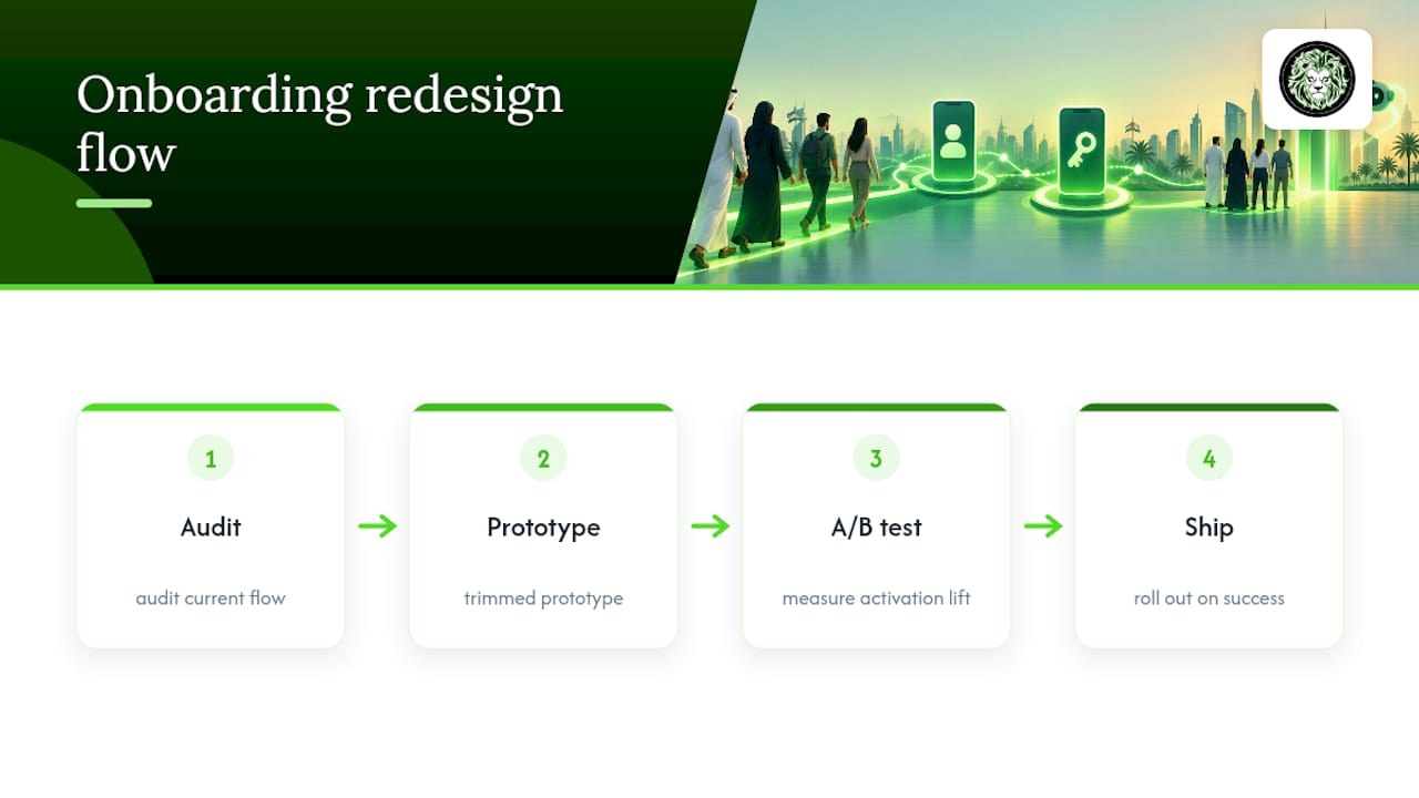
Progressive profiling, collecting details in small pieces tied to features the user is already exploring, tends to outperform upfront forms every time. If your team is stuck between a redesign and a full experiment cycle, an audit first, then a prototype, then an A/B test, is usually the fastest path to a defensible answer.
— Amal
Is There an Ethical Line for Onboarding Nudges?
The selection-prompt research is genuinely useful, but it’s worth separating a nudge that helps a user find value faster from a nudge designed purely to capture attention. The first respects the person using your app. The second borrows engagement now and pays for it in churn later.
Good onboarding preserves choice: a real skip option, a decline that doesn’t punish, a re-prompt policy tied to renewed intent rather than persistence. If a flow only works because the user can’t easily say no, that’s not effective design. It’s a workaround for a product that hasn’t earned the ask yet, and it tends to show up in retention numbers within a quarter.
Turning These Patterns Into a Working Flow
Reading about the two-screen rule and passkey timing is one thing. Building it, testing it against your real user base, and proving it moves activation is another. Proud Lion Studios runs onboarding work as part of broader mobile app development) engagements, starting with an audit of your current flow, followed by a prototype of the trimmed version, then structured A/B testing to confirm the change actually lifts activation before it ships to everyone.
That process pairs UI/UX design work with the kind of instrumentation this article describes, so the redesign isn’t a guess dressed up as a launch. Teams building on Web3 rails face an added layer, wallet connection, key management, and the Web3 UX considerations that come with them, which Proud Lion Studios’ UAE-based team has handled across projects ranging from MVP builds to full production apps. For teams thinking about go-to-market sequencing alongside the redesign, Cerbits Digital’s product playbook is a solid companion resource on tying activation work to growth strategy.
If your onboarding flow hasn’t been touched since launch, or if completion looks fine while activation doesn’t, start with an audit. Reach out through Proud Lion Studios’ mobile app development services page) to scope one.
Sources
A handful of sources are worth bookmarking if you’re building out an onboarding strategy beyond this article:
Field experiment showing selection-prompt onboarding increases engagement (ACM DOI)
Mobile-App Onboarding: An Analysis of Components and Techniques — NN/g
FAQ
What Are the Stages of Mobile Onboarding?
Most flows move through welcome or value framing, account creation, permission requests, initial personalization, and the first genuine action inside the product. Modern guidance compresses this into two mandatory screens, signup and first value, with everything else deferred until it’s actually needed, per 2026 onboarding pattern guidance.
Can You Give Examples of Mobile App Onboarding Done Well?
A fitness app that lets you log one workout before asking for an account demonstrates progressive signup in action. A messaging app that primes contact-permission requests with “Find friends who already use this app” before the system dialog fires is a clean example of permission priming.
What Is Onboarding in a Mobile App?
Onboarding is the sequence of screens and prompts that take a new user from install to their first meaningful action inside the app. Done well, it’s minimal by design, focused on reaching one activation event fast rather than explaining every feature up front.
What Are the Key Principles Behind Effective Onboarding?
Clarity, minimal friction, contextual timing, and consistency tend to anchor most onboarding frameworks, though the exact list varies by source. The through-line across NN/g’s research and Android’s design guidance is the same: don’t ask for more than the moment justifies, and don’t explain what the interface should already make obvious.
Does Proud Lion Studios Build Custom Onboarding Flows?
Yes. Onboarding design and testing fall under Proud Lion Studios’ mobile app development) and UI/UX design work, typically structured as an audit followed by a prototype and A/B test cycle. Pricing depends on scope, and current rates are listed on the services page itself.